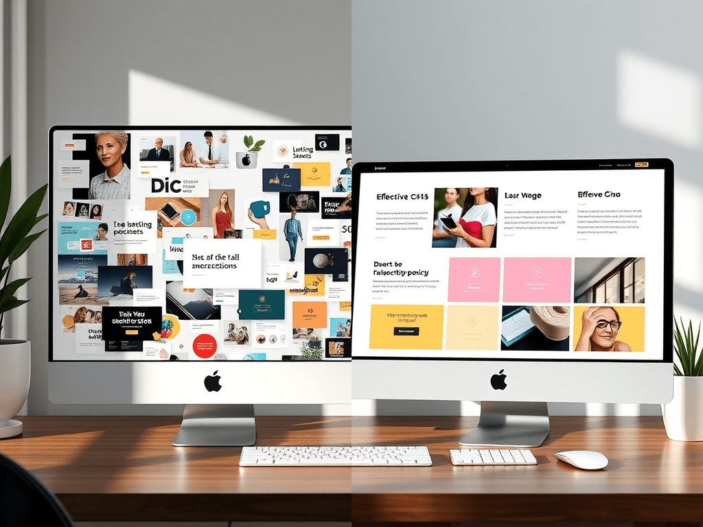
By Panos Christoforou
Founder of Nulizart | Designer, Builder, Strategist
There’s a painful truth no one wants to hear:
Your site might look amazing…
and still be losing you money.
I’ve seen gorgeous sites that win awards—while the business behind them barely survives.
And I’ve seen “ugly” landing pages make thousands.
Design isn’t just about how things look.
It’s about how they work.
Good Design ≠ Pretty
You don’t need an aesthetic masterpiece.
You need design that does its job.
Real design:
- Guides the eye
- Simplifies decisions
- Builds trust
- Converts visitors
Your vibe can be sleek, artsy, minimal, maximal—but if your user is confused or overwhelmed? You’ve already lost.
The 3-Part Formula for Design That Converts
Here’s the framework I use at Nulizart to design for conversion and creativity:
1. Hierarchy = Clarity
Think of your page like a stage. Who’s the star?
If your layout screams everything at once—nothing lands.
Use:
- Strong headlines
- Contrast + spacing
- Clear flow (Z-pattern or F-pattern)
Don’t let your design get in its own way.
2. Structure = Trust
Sloppy or chaotic = “this business isn’t serious.”
Clean, consistent spacing, predictable nav, logical page flow =
“This feels legit.”
You’re not just designing a page.
You’re designing how your brand is perceived.
3. CTA = Direction
A beautiful site with no call-to-action is like a beautiful car with no steering wheel.
Tell people what to do:
- Book a call
- Get a free audit
- Download a guide
And don’t hide it. Repeat it. Highlight it. Make it feel natural and obvious.
smarter design
One of my past clients had a stunning portfolio site—but no leads.
After a 2-week revamp:
- Simplified nav + clearer hierarchy
- 2 CTAs per page
- More social proof + testimonials
Within the first month → bounce rate dropped by 38%, and they booked 5 strategy calls.
The design didn’t get “prettier.”
It got smarter.
Design Mistakes That Cost You
- Text too small to read on mobile
- Pages that load like molasses
- Style overload (too many fonts/colors/animations)
- No CTA above the fold
- A logo that’s beautiful but unreadable
Design is not just for other designers.
It’s for your customers.
Nulizart POV
At Nulizart, we design sites that look good but sell better.
We obsess over aesthetics—yes—but not at the expense of function.
Because smart design isn’t a trend.
It’s your competitive edge.
Ready for a Design Audit?
Let’s see if your aesthetic is costing—or converting.
🛠️ Book a free web design audit with Nulizart
Next in the Funnel Series:
“What Makes a Brand Stick? The Psychology of Magnetic Positioning”
→ We’re going deeper into messaging, memory, and identity.


Leave a comment